I ended my previous post with one of my early design creations, an abstract figure called Modern Man that I drew either while I was in eighth grade or the following year, as a Third Former at The Hill School. 
This design percolated in my mind for years, while the original sat tucked away among other papers through prep school, college, and my years living in Asmara. While I was overseas studying archaeology and languages, I was also writing, both prose and poetry, and was beginning to examine my Scandinavian heritage, Viking history, and Norse literature.
Shortly after my return to the States, while engrossed in a book of Viking Art, I discovered a photograph of a decorative initial letter “D” from an illuminated manuscript. It is an example of an integral part of Viking and Celtic art known as the “Gripping Beast” motif, a stylized dragon, or wurm in Old Norse, intertwined in complex woven patterns, often with tail or some other body part gripped in its mouth or with its hands. I drew a copy of it, and was very pleased with the results. 
I felt a strong association with this bit of calligraphic art, both because it was the initial letter of my last name, and for other more indefinable, subliminal reasons. I drew the design many times, using it as my logo as well as a design element in other work, including a linoleum print block which I carved, and then had a print made into a rubber stamp. 
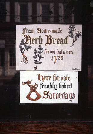
I even included it in this sign I drew for the window of a shop where I worked for a time as manager. 
I had a slow realization, a recovered memory, that gave me a possible explanation for the strong connection I felt with this design. Bubbling up from the dark recesses of my subconscious mind came a recollection of my Modern Man design, which I hadn’t seen for years. It resurfaced as a shadowy image, a rough shape that seemed to resemble the intertwined shape of the gripping beast D. Searching through my collected papers, I finally recovered the drawing of Modern Man. Sure enough, that abstract, a design that folded into itself that I had drawn many years before I saw the gripping beast D, did bear a resemblance to this bit of Norse calligraphy, enough so that I began to wonder if my design may been an atavistic memory from my Viking ancestry. (The jury is still out on that, by the way, but it is intriguing.)
I continued to study the art and literature of my Norse forebears. Actually, the two are closely related, both in the calligraphy and illustrations of the illuminated manuscripts and in the earlier runestones and other decorative work. This runestone, for example, is from Sandby in Öland, Sweden, and has an ornate gripping beast design with an inscription in runes in the outer beast’s body. 
In addition to runestones, many other items were covered with elaborate interwoven designs, such as this example which illustrates the head of Mímir (Mim or Mimr in Old Norse), a character in Norse mythology famed for his well, which like Mimir himself was a font of wisdom, and because after he was beheaded, Odin carried his head and consulted it on matters of occult wisdom. I drew this sketch from a photograph of a bone relief carving of Mimir’s head (Mims huvud). 
During this same time, I had begun to experiment with a new form of poetry, changing from the beat style of Lawrence Ferlinghetti to the alliterative stave-rhyme verse of Old Norse and Anglo-Saxon poetry, of which Beowulf is the best-known example. After finding copies of old Icelandic manuscripts of the Eddas, poetic and prose settings of Norse mythology, lost in other parts of Scandinavia but preserved in medieval Iceland primarily by Snorri Sturluson,12th century historian, poet, and politician, I began to develop my own version of the lettering used in manuscripts such as this one. 
Poetry and calligraphy came together for me late in 1979, as they have before and since, thanks to a woman. In this case, it was a woman of Scandinavian heritage with whom I was enamored who inspired me to wax poetic and artistic. The poem I wrote for her is in the style of Norse sagas, with alliterative stave-rhymes, in which one or more stressed syllables in one half-line carry the same consonant as one in the second half-line. These are internal rhymes within words in a phrase, rather than the end rhyme with which we are more familiar today, where the final word or syllable in a line rhymes with another last word or syllable. Another feature of the stave-rhyme verse style is that the fourth line is sometimes repeated for emphasis with slightly different wording. In addition, the stanza formula of four or five sets of half-lines is broken at one point by another formula in which a set of half-lines is followed by a line with only three stressed syllables, two of which have rhyming consonants. All of these features appear in this poem.
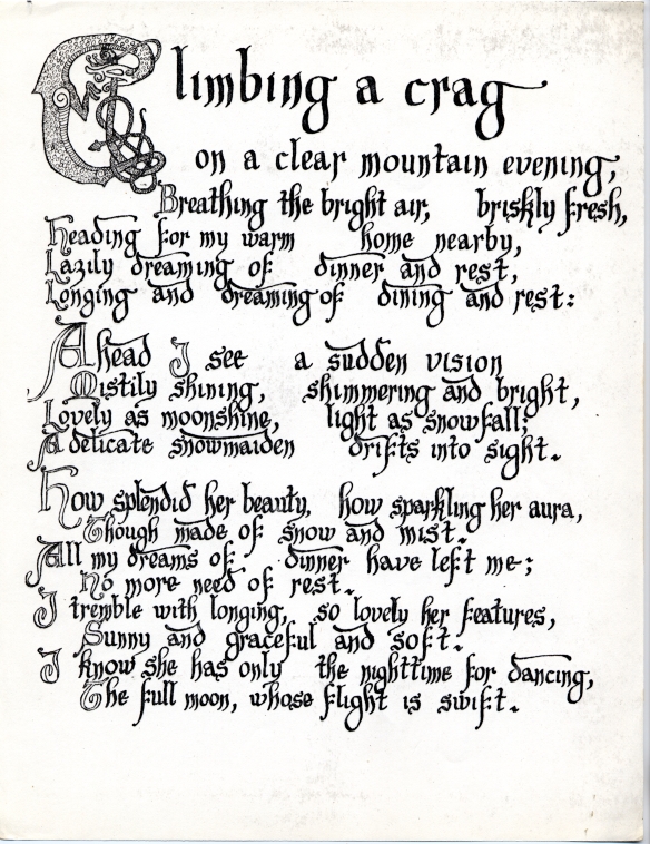
This is a scan of photocopies of the original sheets, which I made with india ink on parchment in November 1979. The lettering is my version of the style I found on the Icelandic manuscripts, although the initial capitals are from another, more well-known lettering style. The capital C at the beginning of the first stanza was my own design, based on the familiar Norse and Celtic gripping beast design, and at the bottom I added a personal inscription in my up-dated version of Viking-era runes in the border surrounding my sketch of a runestone design. This is one example of the dozens of alphabets, syllabaries, hieroglyphs, and other writing systems that I have created as an intellectual exercise or modified from existing historical originals since I took my first linguistics course at Penn. I’ll have more to say about this hobby in a future post. (I’ve removed the name of the woman for whom I created this poetic manuscript for the sake of privacy.)
Not long after writing and illustrating this poem, I moved from an apartment in the town of Wakefield, a few miles north of Boston, to the southern Boston neighborhood known as Dorchester, into the second-floor apartment of a three-decker (or triple-decker), a three story, three apartment wood frame residence common in the neighborhoods of Boston and other eastern Massachusetts cities. While not the exact three-decker I lived in, this one is very similar in appearance. 
I was deeply involved in exploring my Norse heritage at this time. I was a performing member of the Swedish Folk Dance Club of Boston. I studied Icelandic and Old Norse. I gave my apartment a name, which I carved on an old piece of driftwood in letters modified to look like runes. 
The name was Miðgarðhǫll (Midgardhall). Miðgarð is Old Norse for Middle Earth, a name familiar to people who have read the Lord of the Rings novels or seen the films. What may not be as well known is that author J.R.R. Tolkien was an Oxford professor of languages and history of Scandinavia, and Middle Earth was the name for the world of men in Norse mythology.
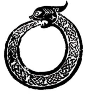
Early in 1980, I created my most ambitious design, one that replaced the gripping beast “D” and became my personal logo for the 80s. I woke from a dream one morning, a dream (or another atavistic memory?) that left me with a very detailed, compelling image in my mind. I immediately went to my desk and began drawing, first in pencil and then pen and ink, the design that I have named Dynamic Equilibrium of Opposites. The design consists of a group of gripping beasts. Two beasts, one white and the other black, are locked in a circle, similar to the ouroboros, an ancient symbol consisting of a single serpent or dragon eating its own tail. 
In the center of the circle formed by the two beasts are two others, in different shades of grey, locked with a tendril from the white beast in the form of a valknut (hero’s knot), a design which I showed in my post about names. 
The combination of these grouped beasts represents opposites in a dynamic balance, meshed with intermediates between the opposites, a sort of Yin-Yang with transitional components between the opposing main elements. 
If I ever decide to wear a tattoo, it will be of this design, but up to now I’ve never been able to decide where I should put it. It remains one of my works of art of which I am most proud and satisfied, and one that represents my nature and my interaction with the world – a dynamic equilibrium of opposites.


